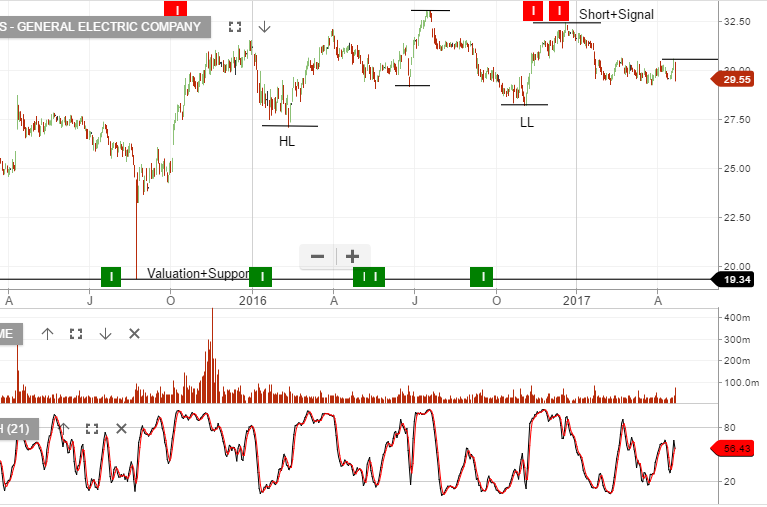
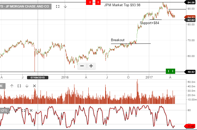
The following charts of Dow Jones’ large caps General Electric and JP Morgan, provide an interesting technical perspective of one of the world’s largest industrial conglomerates and one of America’s largest financial institutions.
GE reported late in the week and at first glance the headline number looked okay, but after digging deeper the free cash flow provided a concern and the stock sold off.
In the case of JP Morgan and other US banks, we’ve watched their share prices sell-off from the March highs as the long end of the yield curve flattens. The implication for banks is, a flattening yield curve will reduce their net interest margins.
US banks have now retraced on average 10%+ from their recent highs.

